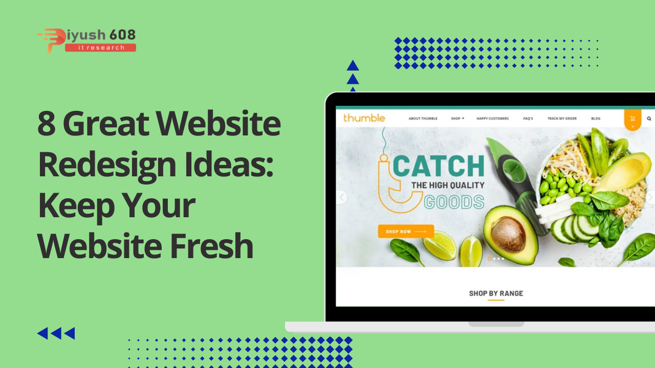
View your business website as a compiled interactive visualization of your brand.
It displays your products, links your social media accounts, includes your brand and contact information
8 Great Website Redesign Ideas To Help Refresh Your Site
- Review your style
- Make your banner as eye-catching as you can
- Adjust it so it is mobile-friendly
- Text check
- Highlight your CTA/make sure they are visible
- Curate your used images
- Make your socials visible/follow buttons
- Keep Hick’s law in mind
1. Review your style
The first on our list of website redesign ideas is auditing your website style.
Using pre-set template designs on your website can be a very attractive option, especially when you are just starting out.
But as you progress, you’ll want to do a thorough scan of everything on your page to make sure it not only looks good in design…
…but it also reflects the personality of your business well and follows your visual style on other platforms.
To find inspiration for website designs for your business, you can visit siteinspire.com.

This site gives you the option to browse through web design references in different categories like the nature of your business or style of design.
2. Make your banner as eye-catching as you can
The average person’s attention span lasts 8 seconds. Also, on average, only 28 percent of the words on a web page are read.
You only have so much time and that much text to grab someone’s attention and entice them to keep scrolling through your website.
And the first thing people see on your website is the banner.
Make sure your banner is visually impressive…
…and that it keeps your page visitors’ attention long enough for them to want to see more of your page.
What are you selling or what service are you providing and why do they need it?
Make sure this information is displayed through your banner graphics in the most attractive way possible.
3. Adjust it so it is mobile friendly
In the last 6 months, 79% of smartphone users have made an online purchase using their mobile device.
And smartphones account for 63% of all retail website visits.
Which makes your website an important part of converting your website traffic into sales through mobile view.
If your font choices are hard to read or if your website’s layout looks cramped on its mobile version…
… you are less likely to impress your visitors, build trust, and communicate what you need.
Be sure to review how your website looks on both Android and Apple mobile devices.
And then, make adjustments to improve clarity for your mobile page visitors.
4. Text check
It’s everything related to text and typography.
Are you using the right brand fonts?
Are you following the correct font hierarchy and alignment on your website?
Is your text size and kerning clear enough to be read on both website and mobile view?
And are the font colors contrasting with their background enough so that your website visitors don’t miss any of the information you’ve added to your page?
Be sure to ask yourself these questions and adjust your website accordingly.
5. Highlight your CTA/make sure they are visible
Once your visitors are on your page, your CTA buttons are there to point them in the right direction and guide them to conversion.
An important upgrade to any website design is to strategically place your CTA where your visitors can easily find them.
6. Curate your used images
Next on our list of website redesign ideas is the picture.
This can be your product images, banners, blog thumbnails among other website images.
And you can increase the overall visual impact and impress your page visitors more…
… just take the time to look at the images on your website and see how you can improve each image.
Make sure your logo is not pixelated.
Update your thumbnails to higher resolution images and avoid stock photos that look too staged.
Touch up your product images so that the lighting is balanced and remove any dust or unwanted particles in the image.
7. Make your socials visible/follow buttons
Your website can help in bringing organic following to your social media pages.
Just make sure all your social links are up and in visible area of your website.
8. Keep Hick’s law in mind
In case you’re not familiar with it, Hick’s Law is a simple idea that says the more options you present to your users…
…the longer it will take them to reach a decision.
This principle is usually neglected and is a potentially dangerous pit for losing customers.
The gist of this is to make sure that you are not bulking up your page with too much information, visuals or functionality in one area.


 +91 7905834592
 Enquiry Now
 piyushmnm@gmail.com
 piyush.gupta384
Reviews
There are no reviews yet. Be the first one to write one.